Version 2: Grid
Monday, October 3, 2005 at 9:15 pm | ![]() Comments off
Comments off
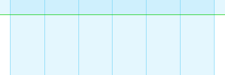
Ok, so I promised to explain the grid system used for this site. This site was built using a strict 6 column grid, with each column being 125px wide. The basic grid for the site looks something like this:

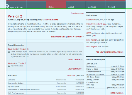
Okay, so now we know we've got 6 even columns to work with. Most pages on the site use a 4/2 grid layout, where the main column takes up 4 grid sections while the other column (sidebar) takes up the remaining 2 sections. Lets take a look at the homepage, with the grid overlaid on it. Notice that I've highlighted the important grid lines in green. Also note that the navigation bar follows the 6 125px columns.

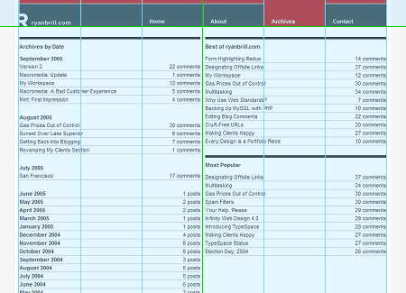
Not every page adhears to the 4/2 grid layout - the archives page uses a 3/3 grid, for instance, as I wanted 2 equal width columns for that page. The important part is not for each page to adhear to the same columns but that each page adhears to the grid.

I'm sure many of you have already noticed the grid design used, but thought it'd be a good idea to point it out anyway. I'll leave you with a few links where you can read up on better explinations of grid systems and how to use them in your designs, as the point of this post was not to go in deapth on grid systems, but rather highlight the grid used for this design.
- Mark Boulton: Five simple steps to designing grid sytems
- Khoi Vinh: Grid Computing... and Design
Comments
Yes well this has given me some ideas on the grid layout style for my website, but this is a really well planned grid system!
Nice work :P
Good looking grid Ryan. It certainly adds to the legibility, and it's good to see you using multiple column configurations.
Nice one.
Nice explanation of the way you gridded your site Ryan. I do like the new design. One thing I've noticed, while following Mark's series and looking at live examples like yours, is how the way a grid feels depends on other things than the measurement. For example, if you would switch the side column on this page from right to left, it will look wider. Even though it's exactly the same 250px.
Mark - Thanks for the kind words... :)
Interesting example for grid system.
Comments are automatically closed after 45 days
October 3rd, 2005
11:57 PM | #
Very interesting, the grid is quite noticable on the site, which I think adds to its look and also helps with the ammount of information your homepage/archives have on their pages. Well done, Ryan.