Nice Error Messages
Tuesday, October 11, 2005 at 7:59 pm | ![]() Comments off
Comments off
I think it is safe to say that error messages are far too often overlooked. But yet, they are such an important element of user experience, and it is extremely important to help users along when a mistake has been made. Let's take a look into the error handing I've used on my contact page. Feel free to error the form, for a better example of how the error processing works. It should be quite painless.
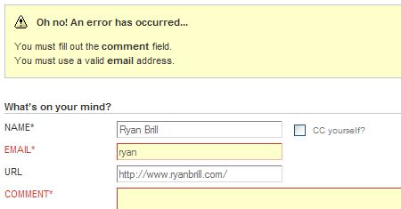
With this form, I've done 3 main things to show the user that there was an error and help them fix it and be on their way.
- Use of an alert icon -
 . This helps the user instantly know that some sort of error has occurred.
 - Concise explanation of what the user did wrong and what needs to be done to fix the problem. I've also used
labelsin the error messages, which allows users to click on the message and be taken to the field that needs to be fixed. - Highlighting of the incomplete or incorrect form fields. Again, this helps users see what fields need to be changed at a glance and takes all guesswork out of what needs to be done and which fields are incorrect.
Don't forget to plan for errors. When users have options, especially when they have the option for direct input, errors are bound to occur. It's important to help users be on their way as quickly and easily as possible.
For those interested in more information on this subject, I highly recommend 37signals' book, Defensive Design for the Web
Comments
Bad, you say? Typographically correct, I say!
Whether or not it's "correct", I'm not persuaded that it looks proper. Hanging quotes for dropcaps is one thing, but I can't remember ever reading a printed book or magazine where quotation marks leading paragraphs were outside the content flow.
Hi Ryan, good stuff as usual.
One minor point: I had no visual clues that your error messages were labels so I had no idea you could click them to jump to the problem field.
Why not use in-page hyperlinks instead?
Instead of <label for='control'>error message</label>
use:
<a href=#control'>error message</a>
Richard - Two reasons.
1. <a href="#control"></a> does not behave the same as <label for="control"></label>. It will scroll you to that field, but it will not focus your cursor in the field.
2. I personally would be afraid to click the hyperlink, as if I did not know what it did, I would expect it to take me somewhere, and thus I would lose all my form information. I would imagine other people would have the same doubts.
You do have a point though, and perhaps when I get time I'll think of an elegant way to fix the problem. It's a pretty minor issue for right now, though. :)
perhaps adding an underline, or making it blend in with other links. However, I agree that I'd be weary with clicking a link while I'm in a form, I almost always open it in a new tab when I encounter links. (though usually this doesn't work, since most places use javascript to pop open a new window on these links).
Your form has partly inspired the way I'm going to be doing the erroring on the project I'm working on, right now. Adding the labels and such to the error messages, very nice idea.
I've just updated the blog comment form error handling to work exactly the same as the contact form. How about that? :)
it's a nice idea but on such a small form highlighting errors seems like overkill.
I like the idea of using the ! icon and not a X. Many people use a red cross like Windows but I find this tends to mean fatal erros and not warning.
Why should the size of the form make any difference on how thoroughly you handle error processing?
Nice work! Very clean.
Just a couple little things I think would perfect it: if you click the preview button, you don't get the error message. You may want to warn the user at this point as well so it potentially saves them another click/server reload--users may think what they're previewing is going to be accepted. After you preview the text then post it, you also lose the preview if you have errors.
In Safari (at least), the frame around the text box doesn't work; some colorblind users may not get what part of the form you're talking about it. For more emphasis you may want to bold the form text as well (instead of just coloring it).
Well the error messages may be sometimes off, but hey at least you have a complete site, mines done sorta, I just have like about 3 things to do :P
But the error messages are looking very good man!
Re: the identation on lists.... I think it looks wrong because the bullets appear in the gutter (the way that this site is designed) with very little white-space to the left of the bullet.... otherwise i don't think it would look quite so bad. (like on mark boulton's site)
good one. error messages, i got a lot of those especially if i was so in a rush to make a comment that i often forgot to fill in the spaces so that's a good thing i guess.
Comments are automatically closed after 45 days
October 11th, 2005
8:25 PM | #
Indeed. The sweet error messages were one of the first things I noticed when I saw the new design, and I was impressed.
As for the book, well, I already won myself a copy. I read it front to back and learned a great deal from it.
By the way, your lists look kind of bad without a left margin...